
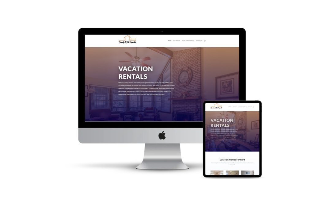
Nothing will turn away a potential customer faster than having a website that is difficult to navigate and view on a mobile phone. As of July 2021, roughly 57% of web traffic occurs on mobile devices. Fortunately, responsive design for websites offers a solution to this issue. Responsive web design allows websites to look great on any device, whether mobile, tablet, or laptop. By having a design that automatically adjusts to fit the size of the screen, the user does not have to scroll, resize or zoom to see the same content on different devices. This optimization leads to more straightforward navigation and prevents click-away simply because the user interface is hard to navigate.
As stated above, more than half of web browsing takes place on mobile devices. As this number grows, it is vital to stay ahead with the latest design trends and technology. Studies have shown that customers are more likely to go to a different competitor’s website if they cannot access it on a mobile device. Having a responsive design prevents you from falling behind competitors with updated sites and staying ahead of those who have not updated yet.
Having a website optimized for mobile browsing holds many different benefits. When browsing a site that is easy to read and navigate on a mobile device, customers are more likely to share these with others via text message. In 2015 Google added having a mobile-optimized site as a standard for the algorithm used to rank websites. This update means that a mobile-friendly site will rank higher than one that is not simply because of optimization for all devices. Responsive design leads to more contact from potential clients because it is easier to reach out with easy-to-use, clickable buttons such as phone numbers or email.
If you have not yet updated your site to use responsive website design, it is easy to see this is the next step for your business!